Technology and the Artist

Technology and the Artist

Art is a passion for many people.  This passion can costs lots of money.  Keeping costs down is important for the survival of any business but especially so for the artist.  One of the costs an artist incurs is in subject matter.  Hiring models, buying still life objects, traveling to painting sites all costs money.  To save money many artists take photographs of their subjects and work in the studio.

My process involves using photos.  I take hundreds of photos a week.  The photos include set compositions or maybe just an effect or a potential item, a cow or herd of cows, that can be added in another painting.  My studio is cluttered with boxes of photos and the photos get scattered all over as I work.

DSCN0194 DSCN0196

Many websites offer deals on photo printing, Walmart, Walgreens, and many other stores offer the same.  By accident I came across a way to cut costs.  I installed a flat screen in my studio.  I like to watch TV when I paint; background noise helps me process better.  While hooking it up I found a USB port.  This allows me to load digital images on to the screen.  This saves me tons of money on printing photos.

DSCN0198DSCN0199

The screen is not too big but the image is clear and I have complete control of my painting environment.  The money saved is significant.  The images I select from my stock is placed on my computer and saved on a USB.  This USB gets plugged in and I am off and painting.

The same can be done with an Ipad.  You can take images on your Ipad and load them on the screen.  You can added images to your Ipad and view them the same way.  You can get an adapter that will allow you to plug your SD Card into the Ipad.  I have an older Ipad but the tools are available for the newer versions.

DSCN0519DSCN0520

This is just one simple way to save money.  There are others.  As an artist you work to succeed or maybe to survive.  Most HD flat screens have USB ports and even include SD card ports.  Your budget will determine what you use but in the long run will save you money and time.

Copyright: Don Jalbert Fine Art

Composition – Some Design Basics

DSCN6920Nantucket Cottages

9 x 12

Oil on Panel

Composition

There is a lot said about composition in artwork. Art scholars are diverse in their opinions about how a painting should be mapped and write books about the detailed compositions of the masters. While I agree that the great masters worked some very complex and detailed compositional designs I also believe that they kept a lot of things simple. It is easy to attach a compositional theory on a work after it has been painted and long after the artist has died. Most artist did not leave detailed written road maps of their compositions. They left thumbnails and studies but usually very little about their ultimate goals with their designs.

Composition can be as complex or as simple as you want.  YOU are the artist. Your creativity is important.  But there are some guidelines to consider.  If you have ever been to a concert or a staged play there are elements that help you interpret the environment.

Modern art historians cannot fathom that any great art could be easily and simply conceived so they establish complex rules but usually AFTER the painting is finished. Many masters did create complex compositions but I believe that they also kept it simple. Take a look at the three images below.

comp3comp1comp2

The “star” of this composition is in the box. The other elements provide interest and balance.  The red box is also known as the Golden Section.  Your primary subject should ideally be arranged in relation to the four corners of the box.

The second image shows the relationship on an actual painting.  The horizontal lines represent the rule of thirds.  To establish a basic guide to your painting, divide the canvas into thirds.  The area in the second is divided into thirds horizontally.  The usual design can be based on one third two thirds.  In the second image the table is the bottom third on which the subject is placed.  The upper two thirds is the background.  The same is true for the third image.  You can find the golden section, the red box, by drawing diagonals from each corner.  Then divide the canvas into thirds horizontally.  Where the diagonals meet the horizontals is the box.

The star and focus of the stage is in the center placed somewhere along the perimeter of the Golden Section. The others are bit players and support the focal point.

Place your subject matter in relation to the box.

Balance

Objects in an artwork need balance

balance1

This arrangement does not work. Everything is far right. The big open area to the left is uninteresting.

All to the right or all to the left is amateurish.

balance2

This arrangement works a little better. The focal point is in the middle, Could be better.

This allows a better focal point but everything is clumped in the middle.

balance3

This arrangement works best. It gives space.  Placement give depth and balance.  Focal point is supported by other elements or interest to the viewer.

balance334

This is the above arrangement within the golden section.

Everything above is a basic guideline to create a pleasing and simple composition.  In computers there is a principle used in programming.  The KISS principle; Keep It Simple Stupid. I don’t like to call anyone stupid I prefer; Keep It Simply Simple.  Work on a simple basic designs and get more complex as you develop your skills.

Your subject is the star of your show.  Let it be seen as such.

Beneath the surface – What you create your masterpiece on.

turkey

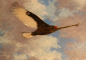
“You do not have to be beautiful to soar like an eagle”

D.E. Jalbert copyright 2015

Surfaces

Canvas:  Canvas usually refers to a cloth like material used by artists as a surface for paintings.  It can be stretched or mounted on boards.  You must be careful when selecting canvas material as it comes in different grades or levels of quality.

Cotton duck is one of the most popular materials.  It is white and comes in different grades.  Cheap cotton duck can be easily torn and this is an easy way to determine the quality of the cloth.  Most pre-stretched and primed cotton duck can be measured this way.  Most pre-stretched and primed cotton canvas is of poor quality and should be avoided.  The priming on these is usually of poor quality also.  The paint drags and gets absorbed by the canvas.  It is best to buy cotton duck by the yard or in rolls and mount and prime it yourself.  Know the quality of what you buy.

DSCN0206

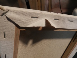
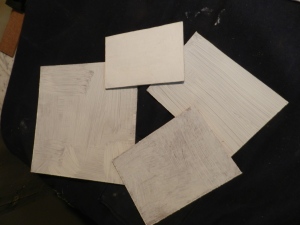
Store bought canvas, back stapled, poor quality cloth. Rip test: Fail

Linen has been used for centuries and is a popular and quality surface for paintings.  It can be mounted, stretched and primed in the same way as cotton duck.  It is also sold pre-primed which makes the process of preparing stretched canvas an easier task.  The priming on linen is usually very good. Linen is typically more expensive than cotton duck.  There are different grades of weave depending upon the type of painting that will be executed on the surface.  Fine weave is used for portraiture and rougher weaves are used for other styles or artwork.

DSCN0203

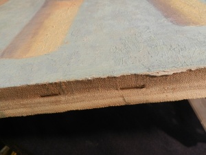
Primed linen the old way, side stapled, rabbit skin glue, lead priming

DSCN0215

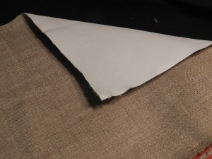
Primed linen, acrylic primed, great quality, great surface.  Bought by the roll, cut and used as needed.

Masonite is a board made of compressed fibers that make a durable surface that is great for painting.  It is a widely used construction material and comes in a variety of thicknesses.  The 1/8 thickness is best for small works up to 12 x 16  the ¼ inch would be best for larger works.  The beauty of Masonite is that it can be cut to any size.  It primes easily and is a solid and endurable surface for all mediums.  It is relatively inexpensive.  Masonite can be purchased in 2 x 4, 4 x 4, and 4 x 8 sheets.  Home Depot will cut it for you to any size you want.  The usual price for a 4 x 8 sheet is around $15 dollars.  And can yield many painting surfaces depending on the size of the cuts.  It can also serve as a good foundation to mount canvas upon.

DSCN0208

Masonite, cut to size, the top two coats, the other three one coat.

DSCN0210

Gessoed panels, painted.

Note:  With modern living spaces growing smaller don’t stray from painting smaller works.

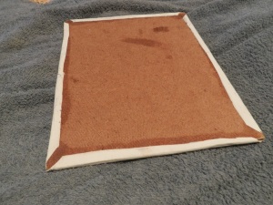
Canvas panels (store bought, canvas over cardboard) should be avoided as much as possible as they are usually of poor quality.  You can create a good quality panel by gluing canvas to Masonite.  The canvas can be unprimed or primed when attached. This creates a sturdy surface with good texture.

DSCN0255DSCN0256

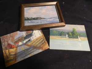
An Example of canvas glued to Masonite.  I coat the panel with an even coat of white glue with a brush, lay the canvas on the panel and smooth it out.  Next I place wax or parchment paper on both sides and place heavy objects upon it, usually several big books to keep it flat and let it dry for a few days.   Right side image shows the same panel from the painted side.

There are many other materials that can be used for painting and care must be taken when selecting the surface you are about to invest much time and paint upon.  The above mentions materials have been proven to be durable over time and can be restored or repaired with some success.  Wood panels(plywood) and cardboard(corrugated) etc, are vulnerable to deterioration and cannot be easily restored or repaired.  Your work is too important and valuable to be placed on poor quality materials.  Painting on corrugated cardboard is painting on trash.

Masonite can be purchased at Home Depot.  One 4 x 8 foot panel costs less than $15. Usually.  The great thing is that at Home Depot they will cut the panel to the size you want.  You bring home all the boards, prime them and you are ready to paint on a very reliable surface very inexpensively.

Another benefit from painting on Masonite is that the panel is more durable.  Accidents happen.  Three different canvases have been punctured this year during transport to show sites.  Though the canvases have been repaired, their value has been diminished a bit as they are now damaged goods.  They have dings.

Dscn0251Dscn0250

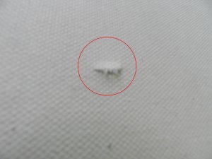
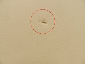
This happened recently.  These photos shows both sides of a puncture caused when the stretched canvas fell from an easel.  This canvas is cheap and was going to be used for experimental purposes.  But this can happen when you least expect it.

This can be repaired fairly easily by making a patch.  A patch is simply a piece of canvas cut about an inch or so larger than the tear.  The patch is “feathered”.  A half inch of the fibers are removed from the edges.  White glue is applied around the area of the tear in the size of the patch and then the patch is laid over the tear.  Parchment or wax paper in placed over the area and a heavy weight is placed upon it to flatten it out.  Once dry the tear is touched up to help it disappear.

Dscn0254DSCN0253

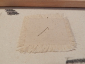
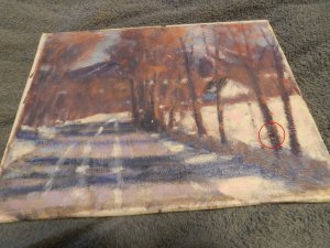
This was a canvas used to help students learn how to patch a tear in canvas.  The left image has the tea, (red circle).  The right image shows the patch that repaired the tear.  When the glue is dry you need to repaint the area where the tear was.

Dscn0256DSCN0255

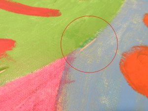
Sometimes the canvas cannot be patched due to where the tear is.  The image on the left had a tear where the red circle is. It was too close to the stretcher bars for a patch to fit.  The canvas was removed and mounted to a Masonite board.  A bit of retouch paint and the painting is saved. 

Priming

The classic way to prime canvas is to stretch the cloth on a frame, apply a sizing usually rabbit skin glue, and then add a layer or two of ground.  In earlier times this was white lead based paint.  Times have changed and some of these steps can be omitted. Canvas can be stretched and then covered with gesso.  Gesso is a product that is water based and can create a great surface to paint on.  Textures can be applied and it will dry fairly quick.  Application can be made with a wide variety of tools but the most common tools are brushed and palette knives.

DSCN0213

Gallery wrap. Cotton Duck primed and stretched on heavy duty stretcher bars.

DSCN0221

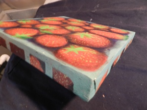
Gallery wrap. Heavy duty stretchers primed and painted on all four sides.  Check with your gallery or art association as to whether or not the images needs to wrap from front to sides or if the sides just need to be painted.

DSCN0211DSCN0218

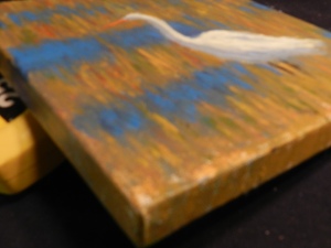
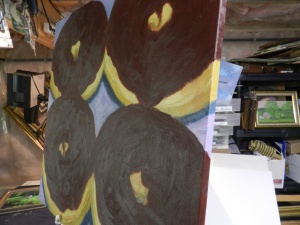
Examples of gallery wraps with standard stretcher bars.  My Art Association would like the sides painted.  The donuts are unfinished.  The format is 36 inches square.  This would require a custom frame.  Painting the sides, eliminates a substantial expense.  By the way…I do love donuts!

There are different grades of gesso.  Again I am not sponsored by anyone but I do like my gesso thick.  If the gesso does not fill the weave the paint will drag across and application will be hindered.  Some gesso products have the consistency of milk and create a difficult painting experience.  Liquitex Heavy Body gesso is thick enough for a one coat application(I usually do two,).  It dries fast.  A quart costs $20 at Michaels.  Get a 50% coupon and you can get it for $10.  Both Michaels and A.C. Moore offer 40 -50% off one item coupons and I always use these to save money.  These coupons vary but come out every week.  Dick Blick and Utrecht Art stores offer considerable bargains and a very wide assortment of art supplies.
Dick Blick Catalog
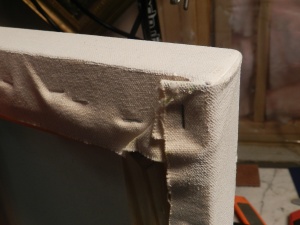
I use Masonite and prime the surface with gesso.  The good thing about Masonite is that it can be cut to whatever size you need.  I strongly recommend using standard sizes for paintings unless you are doing a gallery wrapped canvas.  Gallery wraps are done on stretched canvas using a thick or heavy duty profile stretcher.  The canvas is stapled on the back leaving clean canvas on all four sides.  You don’t need a frame using gallery for display but some galleries and art associations prefer the sides to be painted usually a continuation of the front image around all four sides.  Consult your gallery or association for the exact requirements they prefer.  Also when stapling the canvas to the stretchers use at least a 3/8 staple as anything less has a tendency to pull out during the stretching process.

DSCN0216

The beauty of Masonite.  A “whoops” frame with Masonite cut to fit.

A “whoops” frame is a perfectly good frame that was ordered to a specific special size but never picked up.  Framers have these lying around and they are usually sold at a discount to offset the loss.  Stretched canvas will not fit these frames but Masonite can be cut to fit.  Saves you money, and you get a nice frame for your work.


Paint and your Palette

Bend in the River

Paints and Palette

Your palette is your working area. How you set it up will determine how effective you will work. How you place your paints is a personal matter but there are ways methods or set-ups that will help make your painting experience more productive.

Color.

There are many colors of paint made by many manufacturers. There are expensive paints and there are cheap paints. The quality of your paint should be determined by your budget. You should use the best that you can afford. You will be asking a good sum of money for something you have put your heart and soul into. Therefore you should use the best that you can afford. Emile Gruppe, a great teaching artist and author of many fine books on painting, said; “Paint like you are a millionaire”.   Use good paint and use a lot of it.

The basic paints you will need can be broken down into two categories; tone(value) (light, medium, dark), and temperature (warm or cool). Your primary colors are Yellow (light, warm), red (medium, warm) and blue (dark, cool). The basic store bought colors are listed below with their potential characteristics in relation to all of the above. They are listed in the way they should be placed on your palette. Again, there is no one way of doing this but this way makes sense.

Color Primary relation Light Category Temperature
White None Light Neutral
Cadmium Yellow Yellow Light Warm
Yellow Ochre Yellow Light To medium Warm
Raw Sienna Yellow Medium two dark neutral
Cadmium Orange Yellow and Red Medium Warm
Cadmium Red Red Medium Warm
Alizarin Crimson Red Dark Warm
Burnt Sienna Red Dark Neutral
Diazonine Purple Red and Blue Dark Cool
Permanent green Blue and Yellow Medium Cool
Phalo green yellow or blue shade Blue and Yellow Dark Cool
Cerulean Blue Blue Medium Cool
Ultramarine Blue Dark Cool

Breakdown

White is the absence of color used to tone (lighten other colors or as a color unto itself)

Lemon Yellow or Cadmium Yellow Light  (This is your light yellow)

Cadmium Yellow is a primary color. Can make green or orange   This is a bright medium value Yellow

Yellow Ochre an earthy color like yellow can mix with blue and make green (a more earthy yellow Medium in value)

Raw Sienna a darker earthy color brown-ish( I consider this a dark yellow as it makes green when mixed with blue.)

Cadmium Orange Secondary color. Made of two primaries.  This color saves time and money as you do not have to mix it.

Cadmium Red is a primary color.  It comes in Light, Medium, and dark shades.

Medium Reds:  Carmine, Rose Madder.  These colors help you create special reds and red variations.

e.g.  Rose Madder helps make specific pinks and lavender colors (  The Purple Loosestrife appearing along roads in late summer can be made with this red.

Alizarin Crimson is red based and a warm transparent color.  I treat this as a dark red.

Burnt Sienna is an earthy color with a reddish tone

Diazonine Purple is a secondary color; a mixture of red and blue.  Like orange this is two primaries pre mixed, saves time.

Permanent Green is a secondary color. A mixture of blue and yellow.  Has a distinct tone.

Olive Green:   Olive toned green.

Sap Green:    A concentrated green.

Pthalo Green is a secondary color. A mixture of blue and yellow (This color can be bought in green or blue hues)

Cerulean Blue is a light blue and is a primary color.

Ultramarine Blue is a dark blue and is a transparent primary color.

Pthalo Blue is a dark rich blue and is a primary color.  (This color can be bought in green or red hues)

Note:  Pthalo Blue is a beautiful rich blue.  It is very concentrated therefore it can overwhelm in its application.

Summary

In short you have the primary yellow in three shades or values.

The secondary orange

Primary red in three shades.

Secondary Purple

Secondary green in two shades.

Primary Blue in two shades.

Note. There are many different shades of green, blue, and red. The shades you use are or should be a matter of your personal preference. This set up regardless of the shade you select establishes two major things on your palette. Light to dark and a foundation of the primary colors.   The mixing of any of the colors above can provide the artist with any combination of colors in the spectrum. Black is the only color not listed. Its use is your option. Black can be used to darker colors the same way white can be used to lighten colors. Remember this is a guide to be organized and effective with your most important tool. The exact colors you use are your preference. Maintaining a light to dark and primary based organization on your palette will make your job easier.

You can create any color from the three primaries.  I purchase Orange, Green, and Purple for ease and convenience.  The colors above refer to oil based products.

The colors above in oil may not exactly match the colors of the same name in acrylic.  Oils dry slower and can be manipulated a bit easier.  Acrylics dry rapidly.  Some people swear by them, some swear at them.  There have been times when I have mixed acrylics and the colors have dried so fast that what I originally mixed can no longer be used.

Oils can be unsafe to use.  Solvents are harmful to your body.  Turpentine splashing on your skin in absorbed very quickly and can affect your nervous system.  Odorless products are not odorless.  They have unique odors.  Turpentine doesn’t smell too bad but is very bad for you as a liquid and as a breathable substance.  My wife became very sick from the odors.  I switch to watercolor as a result.  However I was saved when Windsor & Newton came out with water based oils.  I am not endorsing any specific companies in my blogs.  I have no sponsors so I am only sharing what I know from actual use.  But Grumbacher and Holbein also carry water based oils.    The bottom line is to stay healthy.  Water based oils regardless of who sells them are a healthy alternative to turpentine based solvents.

Acrylics do not have the same issues as they are water based.  However, understand that is a polymer based medium.  Polymer is plastic based.  Once your paint dries it is solid and unchangeable. If you forget to clean your brushes you will be throwing them out the next day which can be expensive.

In my work I use oils primarily and I also use acrylic.  It depends upon the subject, size of the work, and the time required to meet any deadlines.  Acrylic dries fast by using evaporation.  The water evaporates leaving the pigment.   Oils dry slower  sometimes almost too slow.  How you use these mediums will depend upon your own styles and work ethics.  Both can be very enjoyable and rewarding.  Both can cause headaches.  Knowing what to expect makes your use of them less frustrating and more enjoyable.

I try to continue this blog as often as possible but recent deadlines have commanded my full attention.

Thanks for reading.

If you have questions email me at  donjalbertfineart@yahoo.com

In the Beginning…

IMG_3412You are an artist. You are highly creative and you march to the beat of your own drum. That drum can be painting, sculpture, ceramics, writing or any one of a number of different concentrations. This blog will concentrate on painting. That does not mean it will be simple nor do I wish to exclude other art forms.  Painting involves many different mediums and many different styles. For all extensive purposes I will focus on painting.

My primary skill set involes oil paint. I believe it is the best medium. It can be dangerous however. The solvents used in oil painting have serious side effects. My primary solvent was Pure Spirits of Gum Turpentine. What I learned was when your skin comes in contact with turpentine or any solvent for that matter your skin absorbs it. Many artist use odorless paint thinner yet I have never found it to be odorless and actually the odor is repulsive. Turpentine is not so bad smelling. Inhaling the fumes of either can have serious detrimental effects on your body. Both can affect your nervous system. I found that I had developed a twitch. My arm would twitch uncontrollably at any time. When my wife began to have adverse effects from the fumes I stopped painting. I turned my talent to writing and drawing. My twitching eventually faded and my wife recovered but I could never use turpentine again.

Luckily, Windsor Newton developed water soluble oil paints. GOD bless them!  There are many other companies producing water soluble oils; Grumbacher, Holbein Duo, to name a few. The paint has many of the characteristics of ordinary oils the big difference was that the solvent is water. Perfectly safe. If you want to use oils I strongly suggest water soluble (a.k.a. water miscible oils). They’re safe and easy to use. I use them exclusively. In this blog I will recommend brands. I get nothing from any brand. I have no sponsors. I am here to help you get doing what you love to do…painting.

My primary subject matters vary. I love landscapes but I paint still life, marine life, seascapes among many other subjects. I am never bored or without a challenge.

DSCN8485 DSCN8506  DSCN0076

My most important tool is my digital camera. There was I time when I spent a fortune on film and processing. Another blessing to artists is the digital camera. I take thousands of pictures a month. Some pictures I take will become a painting. Other pictures my only offer a small part for a painting. I group the pictures by subject and I try to take pictures of specific subjects from the same spot throughout the seasons. This is what I refer to as the Monet effect. Instead on standing in front of a motif every day for weeks. I take a picture every time I am in the vicinity. I get many variations this way and when I do paint a series I have dozens of shots of the same place at different conditions and color schemes. It is not as efficient as Monet but time or lack of it, is an artist’s worst enemy.

Along with my photos I clip pictures out of magazines. I do not use these photos for paintings as they are copyrighted and belong to someone else. But if I need a shot of a cow for my own landscape I will search Yankee Magazine or National Geographic for a cow and use it.

This collection of digital photography and clips is usually refered to as a morgue. Dead images that the artists brings to life in a painting. It is part of my research and planning.

Pictures should rarely be used verbatim. They give you an environment, a mood a setting, a place for you to start working your magic. Do not simply copy photographs. You will get frustrated. Instead use the photograph as the launching pad for your vision.

My next installment will be about getting it all on canvas.

Thank you for reading and may GOD bless you.

Getting Started

DSCN0743

Daisy’s Blooming  Oil  11 x 14

The Practical Artist

Copyright Don Jalbert 2015

Getting Started

This blog is for artists who are looking for the best possible experience with their art career.  Art can be expensive. Art has rules both unwritten and written that can be an asset or a hindrance to an artist.  This blog hopefully will help artists utilize their resources for the best possible artistic experience.

This blog will focus mostly on oil painting and will reflect upon 40 years of experiences both good and bad.

The first thing you as an artist must understand is that you produce a product.  This product is the result of years of education, insight, intuition and experience.  This product must be refined worked and reworked.  This takes time and financial resources. It also takes planning.

Art is all about a presentation.  It starts with your ideas on a canvas and is enhanced by the frame or setting you place it in.  Imagine going to a fancy dinner party, getting all fixed up and expertly groomed then wearing dirty cut-offs and a ripped t-shirt.

Your painting is a piece of you.  The packaging will help those seeing it take it seriously and appreciate it more.

Painting can be very expensive.  Frames can cost hundreds of dollars.  A custom made frame can cost even more.  Beginning artists need to be good financial stewards of their money.  Using standard sized frames will cut your overall costs and still give you a great presentation.

Below is a list of standard sizes AND a list of the appropriate size for your thumbnail drawings and designs.

The formula to find the correct size of the thumbnail is to find the common denominator of the width and the height.  For example for an 8 x 10 canvas the common denominator for each side is two.  So the thumbnail should be 4 x 5.  Galleries refer to 8 x 10 as Landscape orientation.   10 x 8 is portrait orientation. The first number is the vertical or height,  the second number is the width.   Make sure you use these proportions when producing your artwork.  If you decide to paint smaller than 8 x 10 use the exact dimensions for your thumbnail.

Support size Thumbnail size
8 x 10 4 x 5
9 x 12 3 x 4
11 x 14 5 x 7 (rounded)
12 x 16 3 x 4
14 x 18 7 x 9
16 x 20 4 x 5
18 x 24 3 x 4
20 x 24 5 x 6
24 x 30 4 x 5, 8 x 10
24 x 36 4 x 6

Thumbnails are the start of your painting process.  It is where you create your initial design.  But where does your designs come from.

The Practical Artist

IMG_3962

Soaring  Oil   16 x 20

“They will soars on wings…”   Isaiah 40

The Practical Artist

Don Jalbert

Welcome to my blog. You are here because you are an artist or are interested in art. This blog will talk about art from a practical point of view. Many art publications over complicate the techniques and processes involved. There are simple ways to enjoy art. There are practical ways to create art. Over the past 40 years I have learned many things and now I want to pass this information along to you as well as talk about art and artists. As a technology teacher one of the first things I learned was the KISS principle. No, not the band, the principle; Keep It Simple Stupid, though I do not like to call people stupid I prefer Keep it Simply Simple.

Art is a gift. A gift from GOD. In fact, GOD is the ultimate artist. HE created everything. We can never come close to GOD’s level of creativity. But those who are creative share something unique with HIM. Whenever I paint or draw or write I get immense joy and a unique sense of completeness. Imagine how GOD felt when HE made you. You are a wonderfully made creation of HIS hands. No matter what you do HE will always love you and sent HIS own son, JESUS, to die for you so that you can join HIM in heaven. No greater love has ever been given.

As an artist I feel closer to GOD. I have not always known that I was an artist but I can go back to my earliest years and remember seeing things differently. My peers picked up that I was different. There WAS a difference. I didn’t know what it was then. In fact, no one at that time knew what made me and many other people different. Many people consider the difference a handicap but I have found that it is the one thing that has helped me the most as an artist.

Through the centuries artists and inventors have made history creating things. Now believe me I am not trying to make me sound special but I believe that there is a common thread that connects us all. That thread is ADHD or ADD.

DSCN8483

Summer Fields Oil 11 x 14

I first discovered I had it in the nineties when my children were diagnosed with various levels of this now common syndrome. I believe it has been around since time began. It has manifested itself in different degrees and extremes. Some can control it, some have more trouble with it. For a time it was a problem for me but eventually I saw how it can be used and that it helped me produce many different things. As an artist it has been an indispensable tool.

Not all artists have ADD. When I think of DaVinci and his endless waves of creativity, or Van Gogh sticking candles in his hat to paint at night, or the personality of Caravaggio I can’t help think they may have had it. It has been a blessing to me. It helps me see things differently. These things are what helps me be an artist

Over the next few months I will try to help you be a better artist. I will try to help you tap into your creative energy. I make no promises of success as that takes work on your part. Hopefully I will help you work better

DSCN8502

Good Harbor  Oil   6 x 8

If you are reading this and have gotten this far, thank you. I believe in GOD. I capitalize HIS name and related pronouns out of respect. GOD gives us all special gifts and talents. It is up to us to learn what they are and learn to use them.


This site is an affiliate of Dick Blick Art Stores


Next Blog: The Practical Artist: Getting Started